The frustrations involved with adhering to a medication regimen are many, and not everyone has the time to keep track of their prescriptions. Panacea was designed to help people manage their prescriptions quickly and easily by keeping you connected to both your pharmacist and your doctor. You can manage refills, organize appointments, and message your medical team all at the touch of a button. Additionally, Panacea uses innovative nanosensor tech that allows you to log your daily medication effortlessly while brushing your teeth, making it one of the most seamless adherence apps on the market.
Panacea began as a personal project and ultimately became the Capstone for my UX Design specialization. The concept was born out of a lesson in an abnormal psychology course about the difficulties psychiatrists face in getting their patients to adhere to their prescription regimen. In researching this subject it became clear that it was a large-scale problem in need of a comprehensive solution.
In order to better understand the obstacles that prevent proper adherence, I went on safaris with contacts who I knew took prescription medication. I would coordinate to meet with them early in the day to observe their morning rituals and their trips to the pharmacy.
In conjunction with this empathic research, an analysis of other adherence apps was conducted. After much research, it was determined that the majority of adherence apps belonged to three primary categories. The more traditional approach was the Manual Maintenance category, which required the user to log their own adherence data within the app on a daily basis. The other two approaches were more technologically sophisticated and required less user commitment. However, there were some areas in which the manual maintenance apps excelled. For instance, they often had a more comprehensive feature-set than the other two categories, which were highly specialized in a few functions but limited in most others.
In order to distinguish ourselves in the market, we were determined to design a product with both the comprehensive balance of the manual maintenance model and the seamlessness of the accessory and AI-based model.
Taking all the data we had accumulated thus far, we began to define our conceptual point of view. It read as follows:
Prescription medication is the most ubiquitous method for positive change in mood and behavior today, but many people struggle with the complexities of maintaining their medication regimen. Our products will assist users by helping them navigate the complex institutional apparatuses (psychiatric, pharmaceutical, insurance based) necessary to manage their medication while remaining as unintrusive as possible in their day-to-day life. By making software and related accessories that are intuitive, informative, and flexible, we can make self-management easier for users as they go through the process of changing themselves for the better.
The ideation process began primarily through associative exercises and heuristic intuitions.
Eventually, we began focusing on the tools surrounding the morning medication routine that could be leveraged as a sensory device. It was here when we determined that the electric toothbrush is the perfect unobtrusive accessory that can be used for dual purposes. And while the technology for a toothbrush that can perform drug tests via salivary samples exists, it has not yet been implemented into an adherence app.
With an initial concept for an accessory in place, we began conceptualizing the framework of our app. This was done through storyboards and paper prototypes.
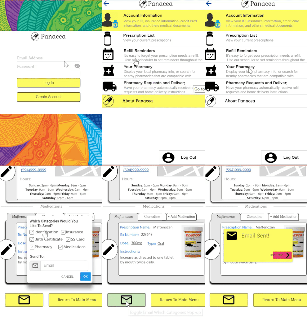
Two iterations of Panacea were designed for initial prototyping. The first design featured a simple root menu and an introductory sequence to help people enter their prescriptions and medical information quickly and seamlessly. The second design emphasized a "gamified" approach in order to increase incentives for the apps daily use.
Both paper prototypes underwent heuristic evaluation by a small sample of volunteers. Many design flaws and possible enhancements were identified during this period. A feature where users could track their daily mood and anxiety confused the evaluators and was ultimately nixed. Additional onboarding screens were created in sections where evaluators consistently requested more clarity. Users were largely frustrated with the “gamified” features and they were removed.
Guided by the data from the evaluation, a comprehensive development plan for the next 4 weeks of iterating was created. A navigational skeleton and a simple wireframe were also constructed for the initial digital draft.
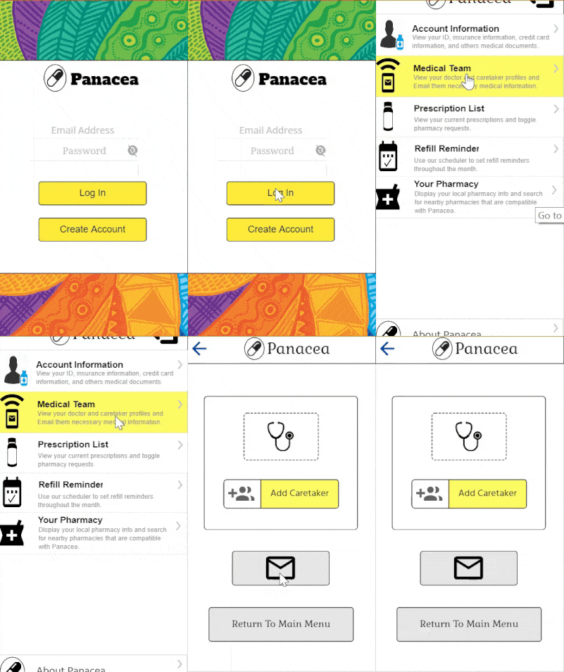
Some in-person user testing was conducted with our wireframe. Among other insights, these tests revealed that users had difficulty locating the "email doctor" function in the app, and it was determined that a new category featuring the users medical team would be implemented for a more intuitive social element. This fits well with the apps conceptual point of view of helping the user navigate the large "eco-system" involved with prescription medication, which obviously includes the users medical team.


Interactive functionality was added to the revised mock-up in order to allow for digital prototyping. A random sample of users were chosen through UserTesting.com to complete specific tasks while using Panacea. While new flaws were identified during these tests, results showed that users ultimately found the interface intuitive and easy to navigate. The app rated low on aesthetic appeal however, with some users saying they would not feel comfortable entering sensitive information into the app because it did not have a professional look. This data became the basis for an aesthetic makeover based around the principles of material design.
In addition to an aesthetic makeover, the final mockup featured some "quality of life" improvements inspired by the data. This included a home page that acted like a dashboard with pertinent information displayed for the user, and an integrated calendar with inputs for both medical appointments and refill schedules. A final round of testing on UserTesting.com was conducted in order to determine the effectiveness of the redesign. Ratings were significantly higher than the previous high-fidelity mock-up by a significant degree. Some final adjustments were made to the design and the project concluded.

No comments.