The Team
The Team

These tools were also extremely helpful in tackling this challenge.
These tools were also extremely helpful in tackling this challenge.

Competitive Analysis
Competitive Analysis


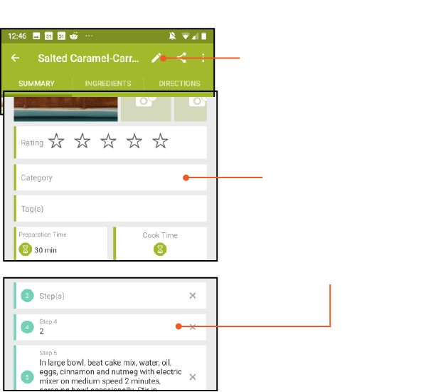

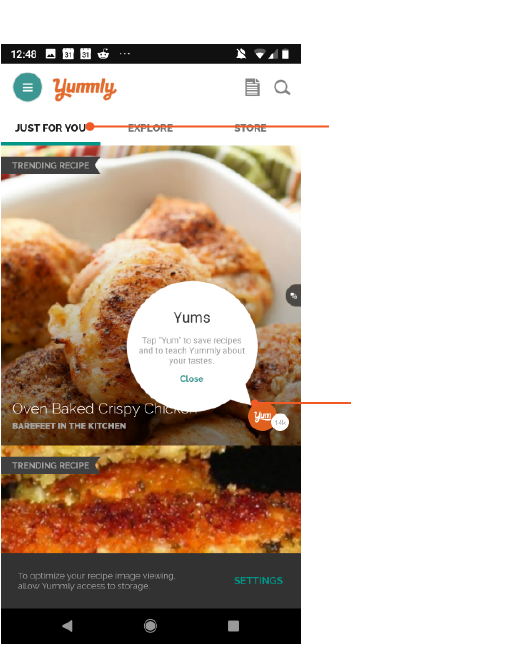

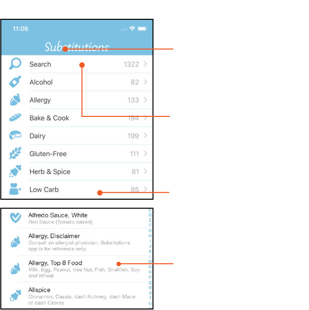

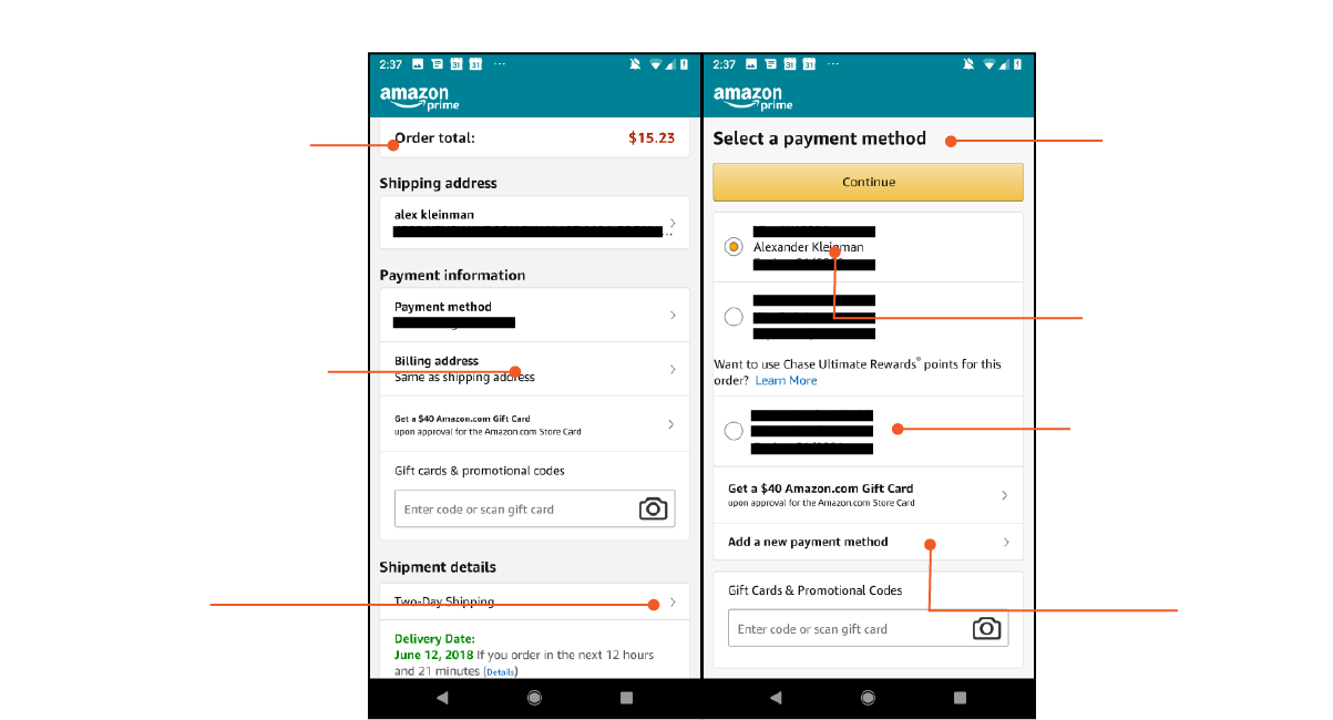

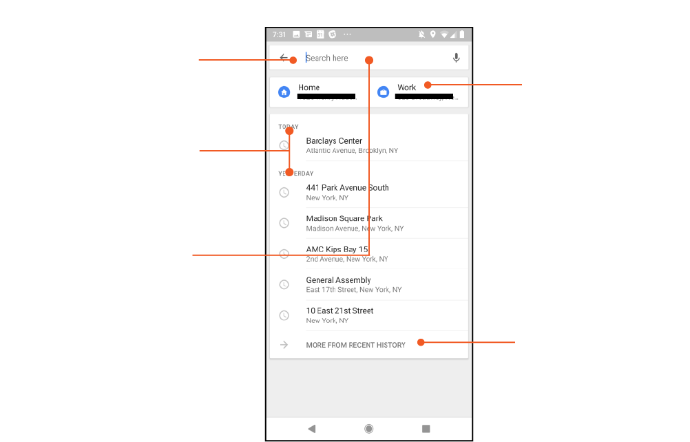

Takeaways
Takeaways
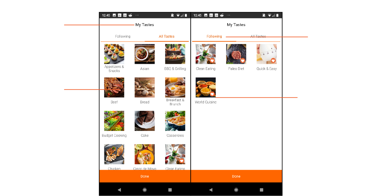
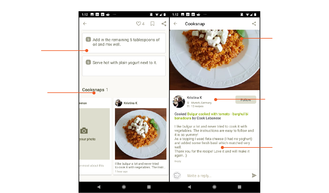
- Some apps offer too much information and too many options at the expense of the user's clarity. Others offer only a very restricted set of options at the expense of flexibility. Our solution needs to offer a broad range of replacement ingredients but each one needs to fit the recipe and ideally elevate the dish.
- The most effective swaps anticipate the type of substitution the user would want to make ie., apps that learn from the users choice, Amazon populating swaps with other credit cards the user has employed in the past.
- The more useful apps limit the swapping process to a single screen. It is a more streamlined approach that is less taxing on the users working memory.
Concept Sketches
Concept Sketches
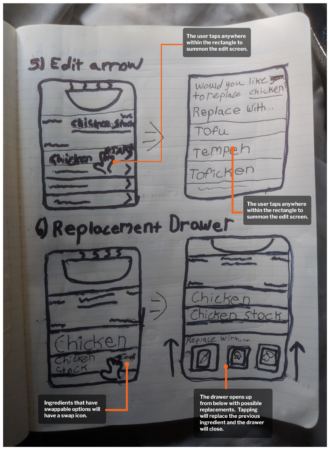
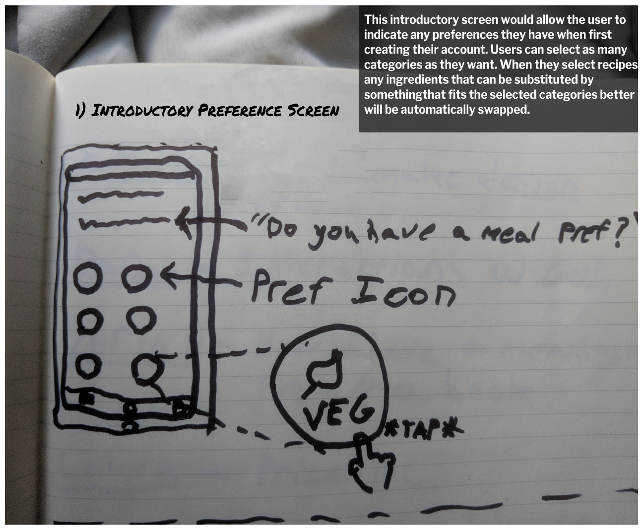
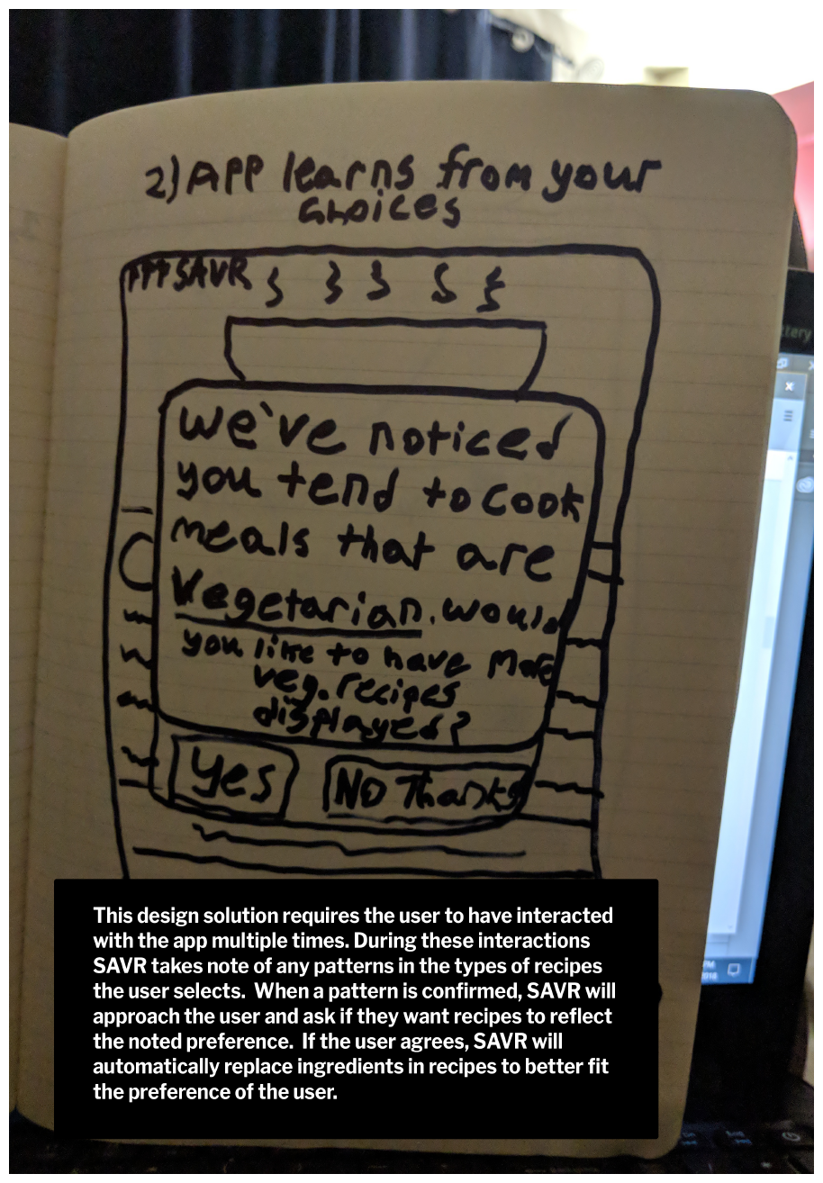
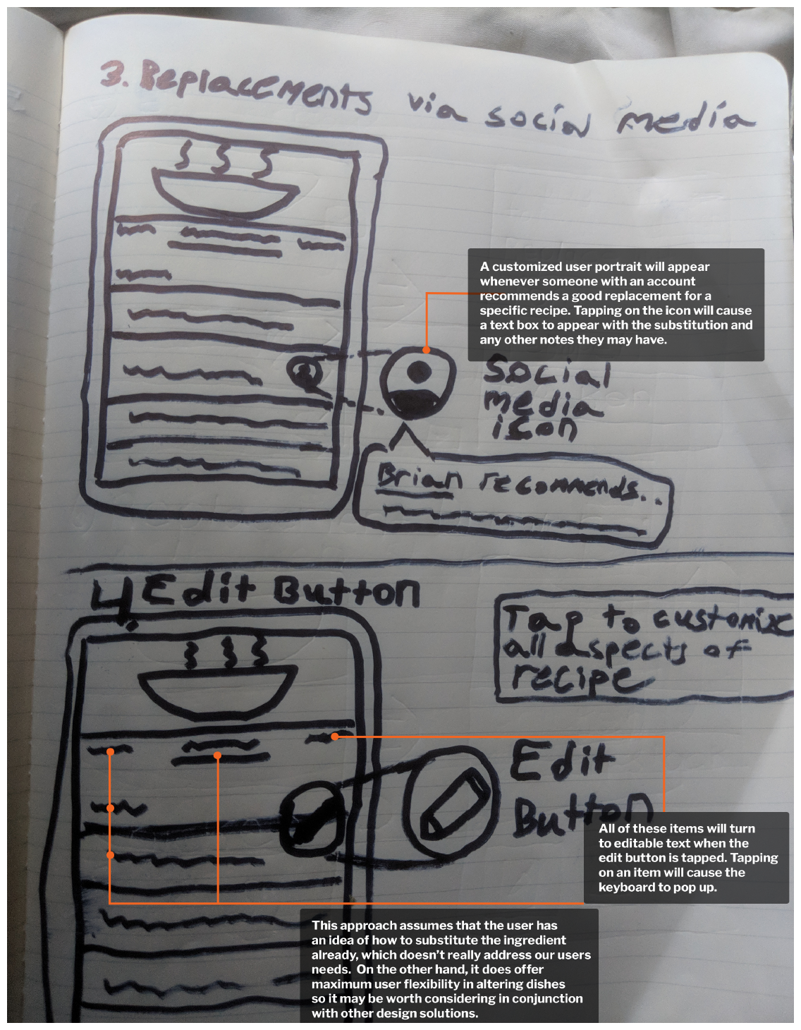
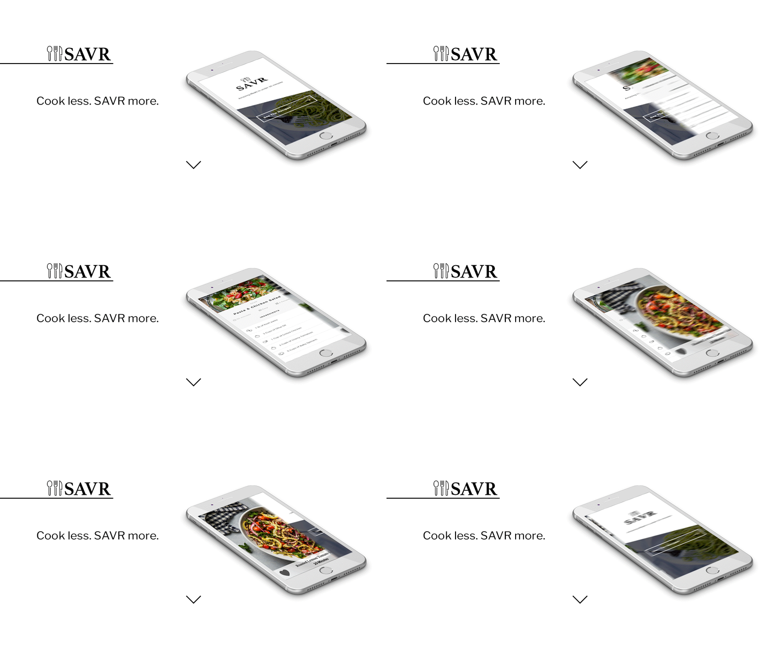
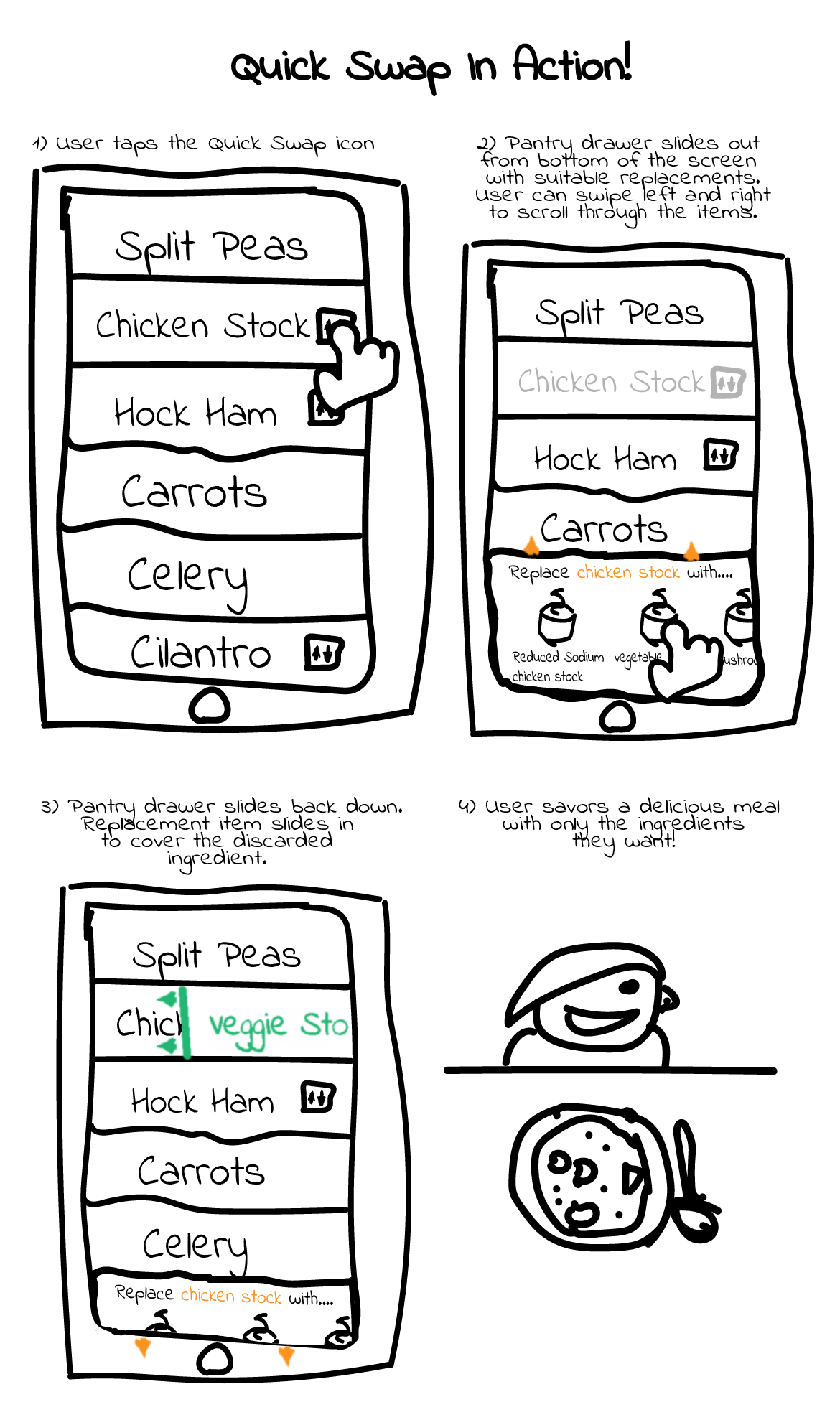
These quick sketches were made to give shape to the specific design concepts that could be derived from the competitive analysis.
These quick sketches were made to give shape to the specific design concepts that could be derived from the competitive analysis. (Scroll left or right).
A Bitesize Pow Wow
A Bitesize Pow Wow
The project brief, the competitive analysis, and the design concepts were presented to my consultants during our monthly meetup.
The project brief, the competitive analysis, and the design concepts were presented to my consultants during our monthly meetup.

John Levy, Design Consultant
"If you're going to color code the item swaps, make sure that they still follow accessibility standards!"
"If you're going to color code the item swaps, make sure that they still follow accessibility standards!"

Hayley Miller, UX Consultant
"You may want to do Speech Bubble User Flows for these concepts, it will help you build empathy for your users and help you determine which concepts will fit their needs."
We discussed which concepts would best satisfy our user's needs. My consultants definitely had their own preferences in terms of which concept to run with, but I wanted to try the User Flow exercise Hayley had mentioned before I made a decision.
User Flow Interaction Summary
User Flow Interaction Summary

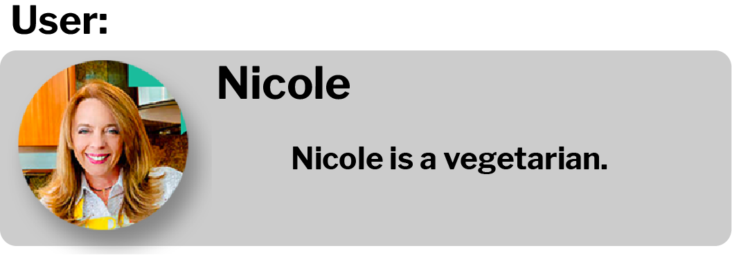
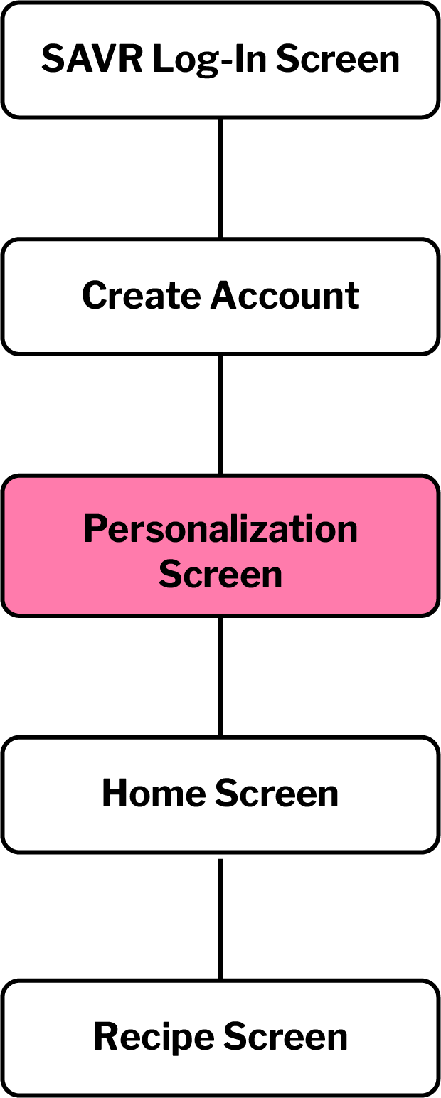
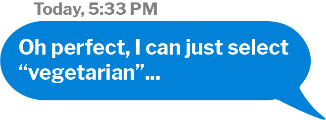
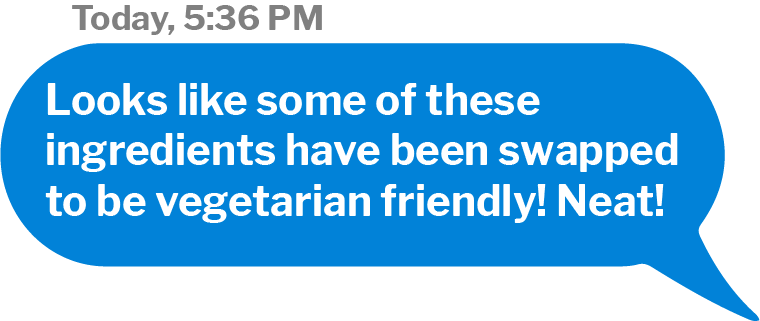
Nicole
Nicole

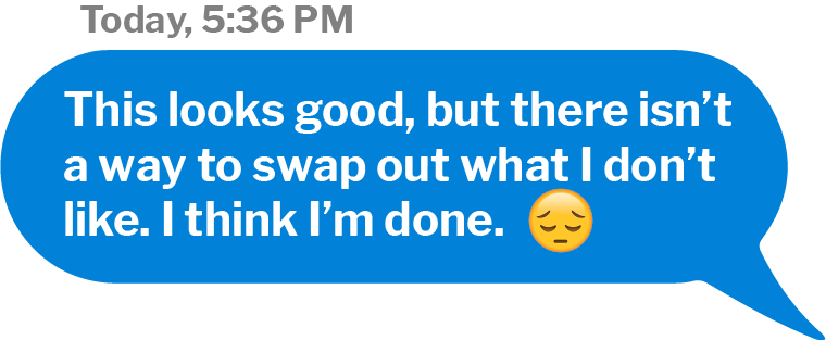
John
John

Lena
Lena


The swap drawer and the substitution page were the only concepts that met the needs of all three personas. We decided that because it was a more streamlined option, the swap drawer would ultimately create a better user experience (although we did return to another of these design concepts later in the project).
Higher Fidelity Sketches
Higher Fidelity Sketches
Wireframes
Wireframes
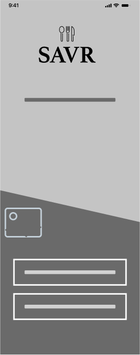
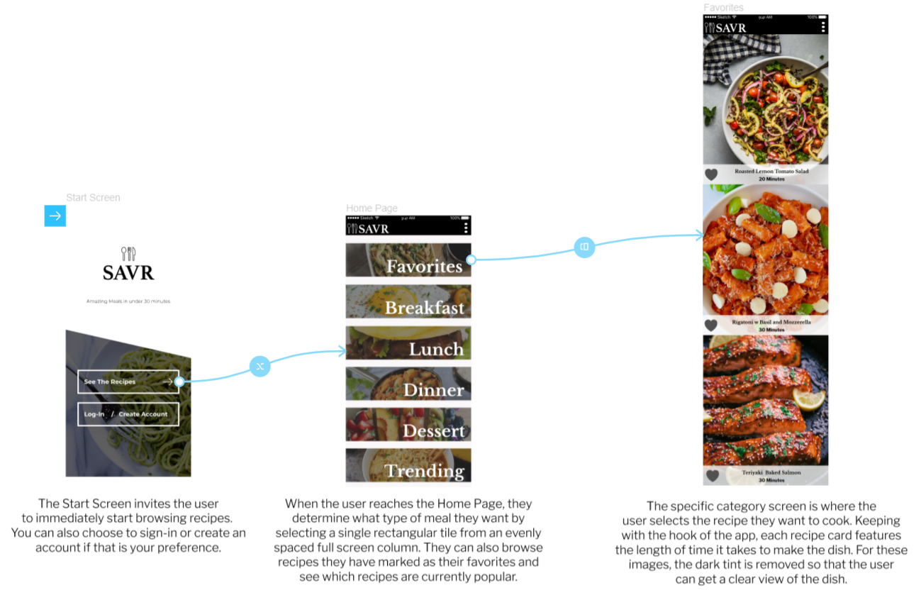
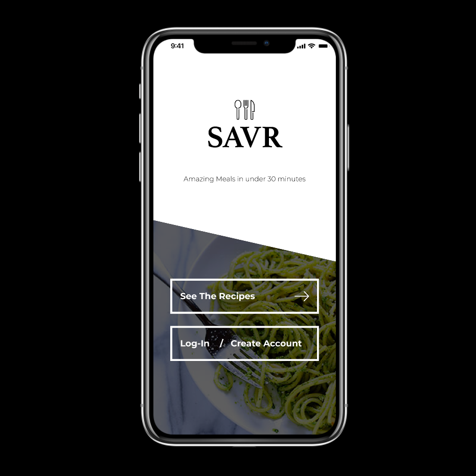
Launch Screen - Users have the option to view recipes immediately or log-in to their account.
Launch Screen - Users have the option to view recipes immediately or log-in to their account.
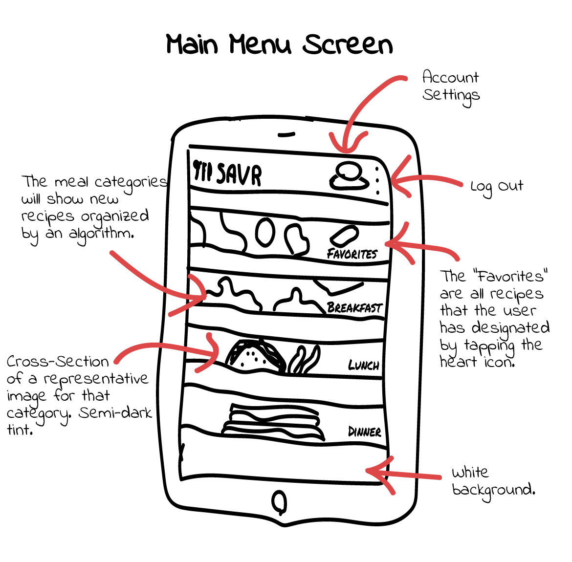
Main Menu Screen - The users are presented with common food categories (breakfast, lunch, dinner, snacks, dessert). The user can also tap the search bar to search for categories or individual recipes they are interested in.
Main Menu Screen - The users are presented with common food categories (breakfast, lunch, dinner, snacks, dessert). The user can also tap the search bar to search for categories or individual recipes they are interested in.

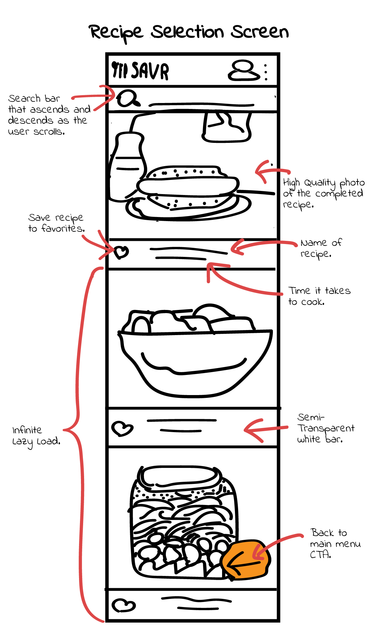
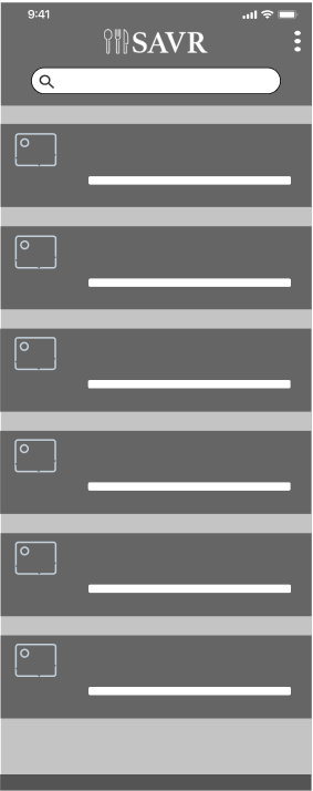
Recipe Selection Screen - The user is presented with high-quality images of each recipe. They can choose to view the recipe and favorite recipes that catch the users interest (for future iterations we want the user to be able to preview the recipe on the same screen so they have a better idea of what they are favoriting). This is an infinite lazy load screen so the user can scroll down looking for recipes indefinitely.
Recipe Selection Screen - The user is presented with high-quality images of each recipe. They can choose to view the recipe and favorite recipes that catch the users interest (for future iterations we want the user to be able to preview the recipe on the same screen so they have a better idea of what they are favoriting). This is an infinite lazy load screen so the user can scroll down looking for recipes indefinitely.

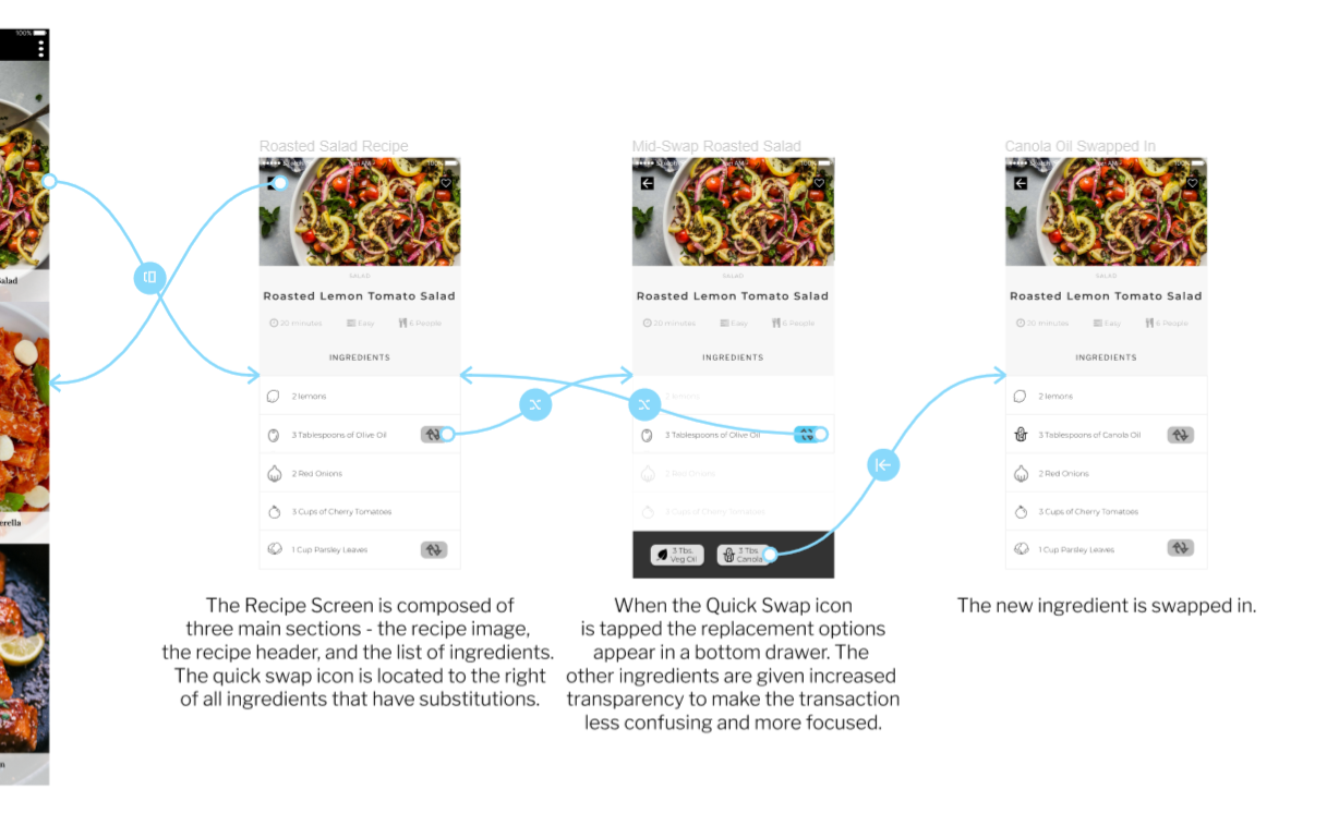
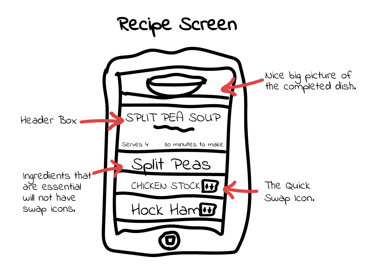
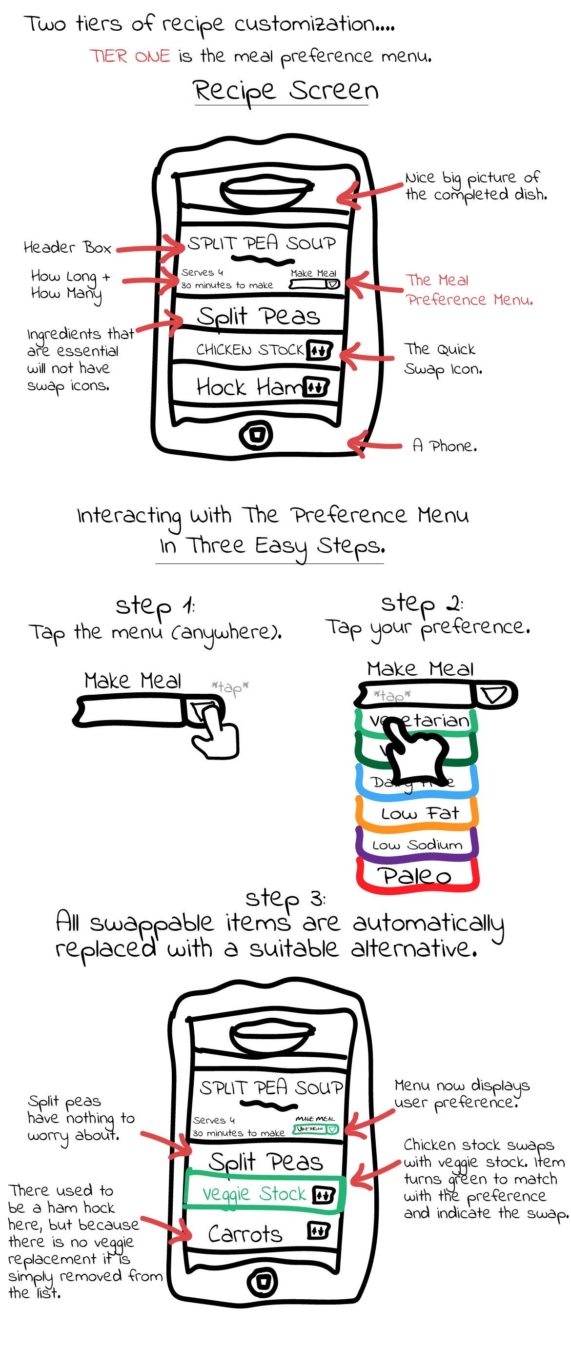
Ingredients/Recipe Screen - The recipe screen features all the key details about the dish from first glance. Each ingredient has a unique wireframe icon on its left and a swap-box icon on the right. Users can also favorite the recipe from this screen.
Ingredients/Recipe Screen - The recipe screen features all the key details about the dish from first glance. Each ingredient has a unique wireframe icon on its left and a swap-box icon on the right. Users can also favorite the recipe from this screen.
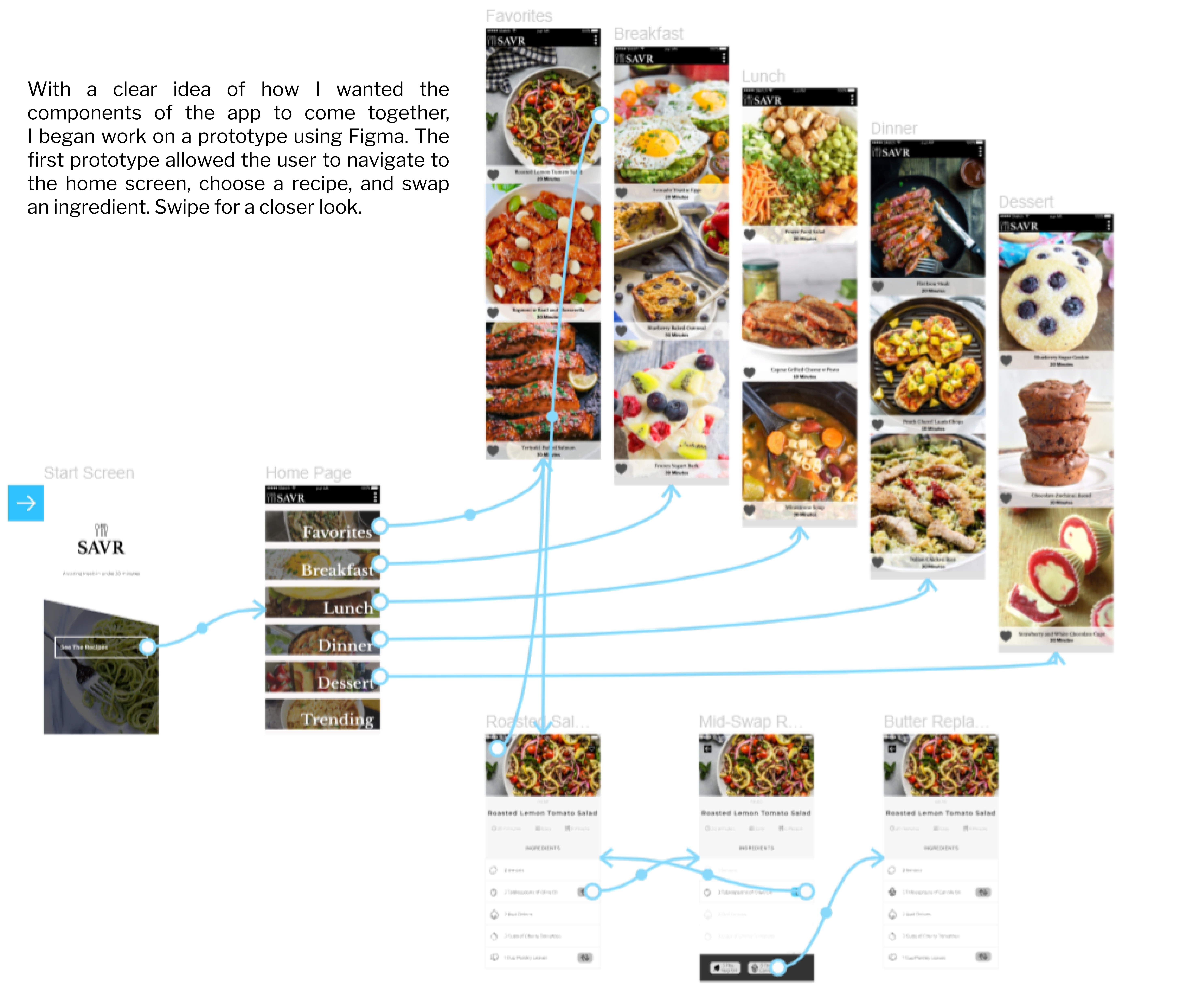
Digital Prototypes
Digital Prototypes
User Testing
User Testing
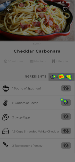
After implementing the meal preference menu into the digital prototype, we were left with a question; would users recognize these two distinct features when using the app? In order to find an answer, we set up a First-Tap Test where the participants would be shown an identical user interface but assigned different tasks before being asked where to tap next. Our hypothesis: 80% of users would tap in the right place regardless of the task.
After implementing the meal preference menu into the digital prototype, we were left with a question; would users recognize these two distinct features when using the app? In order to find an answer, we set up a First-Tap Test where the participants would be shown an identical user interface but assigned different tasks before being asked where to tap next. Our hypothesis: 80% of users would tap in the right place regardless of the task.
Group 1A
Group 1A
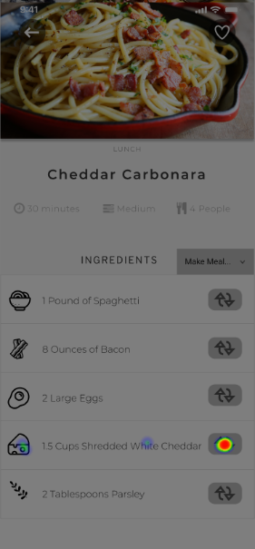
"If you wanted to replace the white cheddar in this recipe, where would you tap first?"
"If you wanted to replace the white cheddar in this recipe, where would you tap first?"
Successful Taps: 13
Successful Taps: 13
Unsuccessful Taps: 3
Unsuccessful Taps: 3
Success Rate: 81%
Success Rate: 81%
User Confidence Rating: [ 4.21 / 7 ]
User Confidence Rating: [ 4.21 / 7 ]
Group 1B
Group 1B
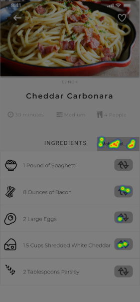
"If you wanted to make this recipe vegan, where would you tap first?"
"If you wanted to replace the white cheddar in this recipe, where would you tap first?"
Successful Taps: 11
Successful Taps: 11
Unsuccessful Taps: 5
Unsuccessful Taps: 5
Success Rate: 69%
Success Rate: 69%
User Confidence Rating: [ 3.16 / 7 ]
User Confidence Rating: [ 3.16 / 7 ]
Group A met our expectations by successfully tapping the Quick Swap icon the vast majority of the time. On the other hand, the success rate for Group B was less than we expected. Additionally, the self-reported confidence was higher in Group A (which rated "pretty confident") than Group B (which rated "confident").
Group A met our expectations by successfully tapping the Quick Swap icon the vast majority of the time. On the other hand, the success rate for Group B was less than we expected. Additionally, the self-reported confidence was higher in Group A (which rated "pretty confident") than Group B (which rated "confident").
With this data, we decided that the category preference menu button needed some adjustments. We concluded that adding an icon, enlarging the surface area, and changing the copy to something that communicates "diet" would be a more useful heuristic for users. We ran another test to verify that the adjustments were effective.
With this data, we decided that the category preference menu button needed some adjustments. We decided that adding an icon, enlarging it slightly, and changing the copy to something that communicates "diet" would be a more useful heuristic for users. We ran another test to verify that the adjustments were effective.

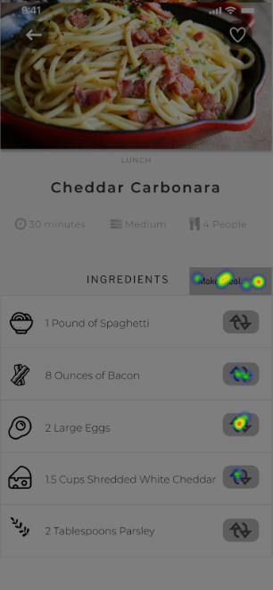
Group 2A featured the same interface as 1B, and the results were proximal just as one would expect. By contrast, the redesigned button resulted in a success rate that exceeded our initial expectations and made the users more confident in the task overall. It was with these results in mind that we updated our prototype interface to feature 2B's preference button.
Group 2A featured the same interface as 1B, and the results reflected one another just as one would expect. By contrast, the redesigned button resulted in a success rate that exceeded our initial expectations and made the users more confident in the task overall. It was with these results in mind that we updated our prototype interface to feature 2B's preference button.
Test Limitations
Test Flaws
- I did not have enough participants for proper A/B testing, and these results do not fit the criteria for statistical significance.
- The framing of the question may be influencing the results. Asking "Group 1A" what they would tap to replace a single ingredient, rather than specifically mentioning white cheddar, may have resulted in a lower success rate.
- I changed three aspects of the category menu button (width, icon, text). A more precise test would only change one feature at a time.
- Many of the participants were from my social circle who possess a high level of tech literacy. A more legitimate user test would be randomly sampled from a larger and more varied population.
- ○ I did not have enough participants for proper A/B testing, and these results do not fit the criteria for statistical significance.
- ○ The framing of the question may be influencing the results. Asking "Group 1A" what they would tap to replace a single ingredient, rather than specifically mentioning white cheddar, may have resulted in a lower success rate.
- ○ I changed three aspects of the category menu button (width, icon, text). A more precise test would only change one feature at a time.
- ○ Many of the participants were from my social circle who possess a high level of tech literacy. A more legitimate user test would be randomly sampled from a larger and more varied population.
Project Review
Project Review

What We Learned
What We Learned
• The importance of user flexibility. SAVR users have a wide variety of motives that did not fit neatly into a single design concept. As a result, we had to implement solutions from multiple angles in order to satisfy the widest cross-section of users, something that we had not considered initially.
• We also learned the value of generating many design concepts, as we ultimately returned to one we had discarded in order to complete our second tier.

What We Could Improve
What We Could Improve
• The app should remember what it is the users want persistently between interactions. Users should be able to choose their dietary preferences in their account settings so that recipes are already swapped without even having to tap.
• The graphic design of the diet menu options is another area that could use improvement. We designed the diet categories to be color-coded and to have a high contrast with the elegant minimalism of the app. But the brightness and hue doesn't really integrate well with the apps aesthetic and would benefit from some additional brainstorming.
• Accessibility issues with the app need to be addressed.

What's Next?
What's Next?
• More User Testing. Would the "swap drawer" be easier to use coming from the right side (nearer to where the user last tapped) as opposed to the bottom? What form of onboarding will help the user grasp this system? Has user retention improved with this system implemented on the live app?
• While SAVR is currently iPhone exclusive, there has been some interest from users in bringing it to the web. How will the swap system be adapted to web formats? What about tablets?
• User Specific Customization. The swap system allows for swaps on a per-recipe basis, but some users may want every recipe to come "pre-swapped" in their preferred categories. A customization screen that allows the user to keep preferences tied to their account would be the next step in SAVR swapping.
Try It Yourself
1. Select "See The Recipes" to begin the test.
2. Select the Dinner menu category.
3. [This step has two parts that can be done in the order you prefer.]
- Adjust the entire recipe for a vegan diet.
- Replace the pasta with a low-carb ingredient.
4. Add the recipe to your favorites.
Thank You For Participating!
Selected Works
Web DesignProject type

Video EditingProject type
Social MediaProject type

Graphic DesignProject type
PhotographyProject type
UXProject type

Alex lives in the downtown core of Rochester NY alongside his lovely wife Charlotte.
He enjoys playing video games, consuming media, writing, and inner city garden cats.
You can contact him at alex.kleinman@gmail.com.
