February 1, 2019Comments are off for this post.

UX Design, Dysgraphia, and Why I’m Jumping Ship

UX is one of the most exciting industries to participate in right now. It's a discipline that draws from psychology, visual design, and engineering in the service of creating products that users love.

In UX, you are expected to draw and write by hand often. You create storyboards, sketch interfaces, and present most of your concepts visually. The drawings themselves often don't need to be more complex than simple stick figures. Like all things UX, the value of the drawing is in the ability to connect and convey information, not its beauty.

A relatively sloppy Crazy-8s exercise, common in UX Design.

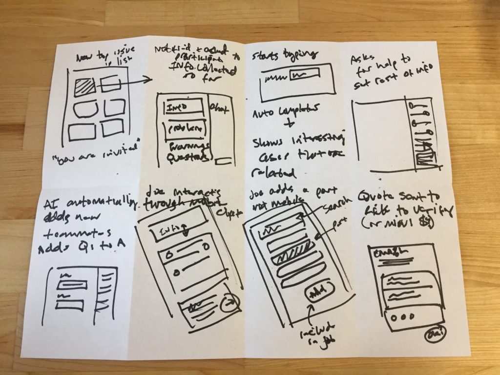
As someone with dysgraphia, I was encouraged by the fact that I didn't need to create works of art in order to get by in UX. I saw it as a great opportunity to get better at a skill I've always admired but never mastered. While I knew that improving my handwriting and drawings would be difficult, I saw it as a worthwhile challenge and a way to expand my creative abilities. I began sketching and writing by hand every day. And there's no question that I managed to improve.

Unfortunately in spite of my improvements, the dysgraphia still limited my abilities to put out hand-made work at a fast clip. The more I needed to write for an assignment, the more difficult it was to write legibly and within the margins. I started seeking out pen grips made specifically to combat dysgraphia, but I still wasn't able to write at the required speed and maintain legibility.

A similar phenomena was evident in my sketches. The first 5 minutes of sketching would often produce the cleanest work, but as I continued drawing, the linework degraded considerably. This wasn't as important as the hand-writing issues because I could still convey the message I needed to, but it was definitely discouraging.

In trying to find role-models within the industry, I did manage to find examples of successful UX designers with bad handwriting. But they could always write fast. Still, the example set by my sloppy handed peers did give me some encouragement and had I persisted I do think I could have ultimately made it work. For those of you who may be in a similar situation, do not be discouraged. The truth is, the reason I decided to leave UX isn't because of the dysgraphia but something a bit more fundamental.

I eventually came to realize that trying to think spacially/visually all day was just not satisfying for me. Just imagining the layout of multiple interfaces, let alone getting them down on paper, was exhausting. I liked describing layouts in words much more than I did envisioning and rendering them. UX designers know that writing is an essential part of the discipline, but not the primary part. If communicating visually all day every day does not come naturally to you, you are likely to struggle in the field. This is different from how skillful you are at drawing, it's about how you think.

The inflection point came as I was working on redesigning the Karma Sauce website. While I'm proud of all the work I did for Karma Sauce, the instances where I received the most positive feedback was whenever I had to write copy for the site. These were also the moments when I felt most creatively at home. It wasn't long after that I made the decision to transition to digital and content marketing. Ironically, moving to a writing field will completely eliminate the obstacles that arise from dysgraphia, which is a nice bonus.

I'm very excited about this new trajectory, and I have no doubt that the skills I've learned in UX will be helpful in crafting digital marketing experiences.


August 20, 2018Comments are off for this post.

Color Power Rankings Part 1

These are personal, not trending.

1. Orange

Orange is unequivocally the best color. By degree, red and yellow are both colors associated with danger and alarm. Not so with orange. Instead, orange is that whistful twang you feel during autumn. It is unique in being both warm and inviting. Orange is to red what your chill uncle is to your opressive parents.

2. Green

Green has a very wide range of big moods. It's ties to natural splendor alone make it a color of rejuvination, the untamed, health, liberation, authenticity and groundedness. It is also the color of envy, simulation, sickness, inexperience, mold, decay, money and greed. For these reasons I consider green to be the color of psychological complexity and ambiguousness. It tells the story of humanity in its confrontations with death and natural order on the one hand, and the virtual world of currency, status and expertise on the other. Nietzsche liked the color green.

3. Purple

Purple dye was once a very rare commodity because of how difficult and time intensive it was to milk the predatory snails that secreted it. In addition, the "mauve" zone in Twin Peaks was so beautiful I cried. Honestly, purple should probably be higher on the list. Purple contains multitudes...but also contradictions. It is, on the one hand, a color of mystery and magic, the color of that which lies outside the techno-scientific biopower apparatus that glues us all in place. At the same time, it is the color of royalty and the upper crust, the color of supremacy and the reigning order. How do we synthesize these contradictions? Do guillotines come in purple?

4. Blue

In both the US and in Europe, blue is the most beloved overall color amongst both men and women. The color blue is invited to every party and is, ironically, never thirsty (because it's the color of water, see?). Blue is percieved as (but may not actually be) the color of professionalism, harmony, confidence, the infinite and the imagination. The future is so bright for blue that it's quickly becoming turquoise. But there's a light tickle at the back of Blue's throat that he just can't ignore. No matter how popular and well connected blue is, there is always that tinge of sadness, that tinge of isolation, that no social validation will ever cure.

July 30, 2018Comments are off for this post.

Pomodoro + Block Site = ???

I have been using the Pomodoro technique through the app Focus 10, and the results have been good. It allows you to chunk your work in a way that is conducive to finding your flow. I've been using it casually, meaning I'm not strictly adhering to the Pomodoro sequence and rulesets (I have never "abandoned a Pomodoro" because an unexpected distraction has arisen).

Whenever I'm confronted with a loading screen or some other technical hitch that requires waiting, I almost instinctually load Twitter and see what's doing. This is true whether I'm on the Pomodoro clock or not. But when I am on the clock, reading twitter even for a minute completely murders my flow, much more than the technical setback does (I imagine this is primarily because social media is depressing as hell). Which is why I usually pair my Focus 10 with Block Site. This second layer of flow-protection prevents my Twitter muscle memory from taking my focus away from work, even for a minute.

For my SmartPhone I have a similar system using a "Minimalistic Material Timer" and ClearLock. But it's cumbersome to have to sync two apps at the same time.

I think creating an app that integrates these two functions into a single app would be well received. During a Pomodoro "work sequence", user-selected apps will be locked from use. During the "break sequence", they are unlocked. As a web-browser plug-in it would work the same way, but blocking websites instead of apps.

I'm going to start designing this concept and see where it goes.

August 10, 2017Comments are off for this post.

First Things First

In 1999 Adbusters released the "First Things First" manifesto, a declaration from a group of graphic designers and visual communicators to rethink the political aspects of their design:

We propose a reversal of priorities in favour of more useful, lasting and democratic forms of communication – a mindshift away from product marketing and toward the exploration and production of a new kind of meaning.

The manifesto was in fact a verbatim reproduction of an article of the same name, released by the legendary graphic designer Ken Garland in 1964.

60 years later, you can still read the manifesto and understand its relevance to contemporary circumstance.  And in fact, the central issue of arts relation to politics has been a perennial topic in philosophy ever since Plato decided it was politically necessary to eject poets from the republic.

With this blog I hope to explore the relationship between the new design perspective of UX in relation to the territory Ken Garland initially staked out.  Is it possible for UX to become a way to explore and produce the new kinds of meaning the manifesto advocates?


Also I might just shit-post random junk about being a designer and cat gifs.

1687463243850 1


Alex lives in the downtown core of Rochester NY alongside his lovely wife Charlotte.
He enjoys playing video games, consuming media, writing, and inner city garden cats.
You can contact him at alex.kleinman@gmail.com.